
Sep '09 - Oct '11
Don't get used to this back-to-back posting rhythm, but I told you they'd come quickly...
This quarter I took an interesting seminar with Professor Karen Lewis called "Diagrammatic." The seminar focused on the history of diagramming in architecture and was split into progressive categories:
Forms & Relationships
Abstract Machines
Processing Program
Datascapes
Systems & Networks
Landscape Dynamics
Flexible & Intelligent
Each of these categories had related readings and discussions. The seminer produced a lot of interesting conversation, although I felt the categories seemed a bit general, which made most of the discussions overlap with each other.
In the end, each student had to write an academic "blog post" for our KSA Community blog page for the class. The goal of this blog is to be a huge database of architectural diagrams for reference to learn about different types of diagrams. Should be interesting as it develops. As of now, the blog is private, however, until it grows large enough and is properly curated.
The overlap of the discussions caused quite a bit of frustration for me. Especially in the datascape category. It seemed that anything that visualized data got to be called a datascape, and I could not stand it. Therefore, my paper entitled It's probably not a datascape. explored what are datascapes, what are not datascapes, and how we can create and identify them by specific characteristics.
This quarter was a whole lot of writing, but this was a short paper that's a really quick read. I'll post below...
It's probably not a datascape.
Data is everywhere. And we are obsessed. With so much data quickly available to the masses, we certainly have found lovely ways of representing this information. If we look to the work of Adam Bly and SEED Magazine, or maybe the stunning representations designed by Catalog Tree, we find numerous ways of taking the available data and examining it through techniques of graphic design and scientific analysis. But just because these methods find ways of reassessing the visualization of data, does that truly make them datascapes? Probably not.
Not to be confused with other forms of data visualization - ie. datanets, dataspheres, or datablocks - datascapes have a strong relationship to formal spatial realization of extrapolations and assumptions of the data behind them. These resulting unexpected forms go beyond artistic representation of known geometries and create abstract seas of meaning through the mining of specific datasets. (1) Triggering an oscillation between topographies and topologies, these spatial arrangements inflict flow, direction, context, and order rather than simple, isolated graphic representations of data quantities where scalar differences are not read as a type of spatial reasoning. (2)
Of course, it’s easy to misinterpret any data visualization for a datascape. But in the contemporary discourse of the aforementioned data-genres, it’s important to recognize specific qualifications for datascapes. Showing its age, Edward R. Tufte’s seminal text Envisioning Information uses the term “data” ubiquitously throughout his five categories of representation: escaping flatland; micro/macro readings; layering and separation; small multiples; color and information; and narratives of space and time. (3) And although Tufte never uses the term “datascape,” as it is a much more contemporary term, his descriptions of data through the given investigations, especially narratives of space and time, ignore the specifics of visualization classifications and offer a false hope that anything could be a datascape.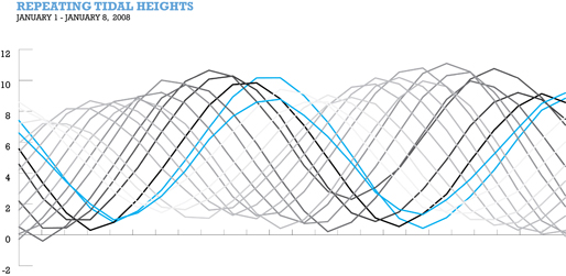
Much like a diagram I did for a Waterkeeper’s Alliance project in Boston, MA, the nature of the graph displays the cyclical nature of the rising tides through both location and time. Location, in the case, being depth of water and time being time of day as related to the corrensponding month. This diagram, however, cannot be a datascape because of its neglected context and lack of topological reorganization in relation to the datasets from which the waves are formed.
A topological reorganization typically lends itself to mapping. Maps are also often targets of the datascape label. Tufte describes the China Railway Timetable as a “combination of flatland and data table.” (4) Because of the broad use of the term “data,” one may think that this is a datascape. However, although the diagram is clearly a map giving spatial arrangements inflicting flow, direction, context, and order, the map fails to truly express any identifiable quantities of information, as inferred by Tufte’s data table description, and does not exhibit a qualitative experience in space. (5) Datascapes may occasionally use maps, but all maps and mappings are not datascapes.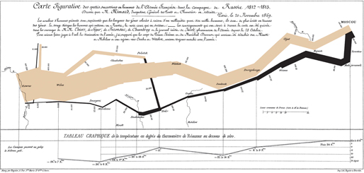
Conversely, Tufte’s analysis of Charles Joseph Minard’s graph of Napolean’s March offers more specific characteristics that clearly qualify the diagram as a datascape. Termed a “data-map and time series,” this map is unquestionably an inference of qualitative experience in space. (6) Placed on a minimally labeled map of Russia, the two bands of color show the spatial advance and retreat of the army to and from Moscow. These bands are then encoded with casualty numbers, visualized through the thickness of the band relating to army size at a given time. This graphic stylization of complex datasets creates a journey of context and interaction through the understanding of depth, order, and flow. The viewer of the graph is able to affix the context of the information, while simultaneously understand the multivariate datasets that vivify the devastating losses of the French Army.
In architecture, datascapes are used as a powerful tool, but they are still often inaccurately defined. As a visual representation of all quantifiable forces of influence, (7) it seems like any type of measurable data may be considered a datascape if it’s represented graphically. Similar to what Winy Maas states in “Datascape: The Final Extravaganza,” a number of manifestations may become “scapes” of data - from lighting regulations to acoustic treatments. And perhaps, early demonstrations of architectural datascapes are the drawings of the New York City set-back requirements in zoning codes by Hugh Ferriss. Through a more contemporary lens, we may look to OMA’s diagrams for the Seattle Public Library in comparison. These diagrams, although seemingly defined as datablocks, are programmatic datascapes. Looking closely, the OMA diagrams encode the colored blocks with data. Size represents programmatic footprint, and we might assume that vertical placement in the column has some sort of formal implications to the arrangement of the building, giving the data of programmatic size a specific spatial reasoning.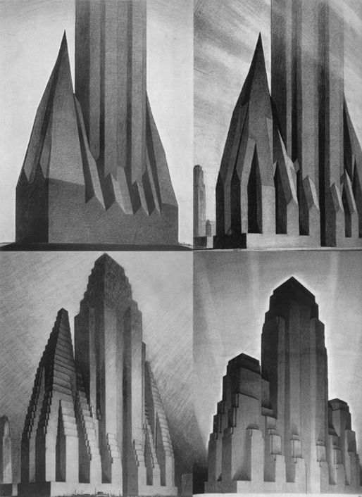
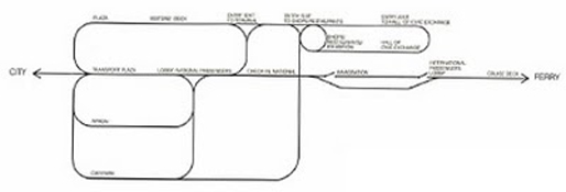
Similarly programmatic, but not a datascape, is FOA’s no-return diagram for the Yokohama Port Terminal project. Although contextual, and produced out of spatial performance, it is based on programmatic characteristics and not data. Different from the Seattle Public Library diagram, but much like the China Railway Timetable, the programmatic nodes do not spatially explore any quantifiable information. Therefore, it is not a datascape, but rather an “instrument to determine and explore architectural performance.” (8) It becomes a functional diagram. However, if it absorbs the data of load-bearing structures and other technical information, which influences a form or scape, (9) it becomes a formal, spatial representation of that data rather than just a programmatic functional flow-chart. Thus, making it a datascape because of its spatial representations as related to context.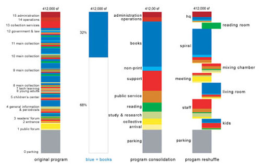
Probably the most popular architect using datascapes as a mode of design influence and production is MVRDV. Through their research in projects such as Pig City and Metacity/Datatown, the architects are able to create “unexpected forms that go beyond artistic intuition or known geometry” and replace it with completely data-driven formal realizations. (10) Based on the understanding that an average pig in the Netherlands must have 664 meters-squared for pork-raising, (11) the towers in Pig City become a three-dimensional datascape of quantifiable statistics of floor area in a form of spatial reasoning. Comparably, Metacity/Datatown is a city described completely by data with no given topography and no context. (12) However, as each individual block represents a three dimensional spatialization of specific datasets, the viewer is able to organize that data into a topological structure in order to aid their understanding of the realized environment. (13) Moreover, the datascapes of Metacity/Datatown are able to use methods of representation that have meaning, are full of prospective manipulations, structured, and seem to be located in a very specific place. (14)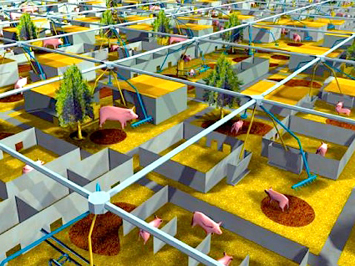

It’s not that datascapes are rare or tough to make, it’s just that the term is too generously applied to any graphic representation of data. Bar graphs, programmatic flow charts, and transportation mappings often get blindly tossed under the same descriptive title as real datascapes. This is because we enjoy seeing pretty manifestations of the data that influences our everyday lives and assume that if we can visually see the data, it must be a datascape. However, as we continue to use data more and more as a design catalyst, we must recognize the different genres of data visualization and understand how datascapes function and how they are created. Heavily related to a landscape, a datascape must have a strong relationship to formal spatial realizations in terms of topological reorganizations. These manifestations must interact with contextual information through depth, order, and flow - not merely be a simple measure of location, time, or amount. The most effective datascapes allow the viewer to organize data into a familiar topological structure in order to understand the realized environment. And even then, when we’ve mined the data from various charts and graphs, and placed it beautifully across a geographical drawing, will it be correctly labeled a datascape? Probably not.
(1) Maas, Winy. "Datascape: The Final Extravaganza." Diadolos 69/70 (1998/99): 48-53. Print.
(2) Klanten, Robert. "Datascapes." Data Flow: Visualising Information in Graphic Design. Berlin: Gestalten, 2008. 97-98. Print.
(3) Tufte, Edward R. Envisioning Information. Cheshire, CT: Graphics, 1990. Print.
(4) Tufte, Edward R. Envisioning Information. Cheshire, CT: Graphics, 1990. 103. Print.
(5) Klanten, Robert. "Datascapes." Data Flow: Visualising Information in Graphic Design. Berlin: Gestalten, 2008. 97-98. Print.
(6) "Edward Tufte: New ET Writings, Artworks & News." The Work of Edward Tufte and Graphics Press. 2 Aug. 2002. Web. 29 May 2011. .
(7) Lootsma, Bart. “Reality Bytes: The Meaning of Research in the Second Modern Age,”
Diadalos 69-70 (Dec 1998): 8-21.
(8) Moussavi, Farshid, and Alejandro Zaera Polo. "Foreign Office Architects." Architectural Review 1307 (2006): 61. Print.
(9) Moussavi, Farshid, and Alejandro Zaera Polo. "Foreign Office Architects." Architectural Review 1307 (2006): 61. Print.
(10) Maas, Winy. "Datascape: The Final Extravaganza." Diadolos 69/70 (1998/99): 48-53. Print.
(11) "Pig City." MVRDV. Web. 01 June 2011. .
(12) "Meta City/Datatown." MVRDV. Web. 01 June 2011. .
(13) Klanten, Robert. "Datascapes." Data Flow: Visualising Information in Graphic Design. Berlin: Gestalten, 2008. 97-98. Print.
(14) Van Berkel, Ben, and Caroline Bos. "Diagrams: Interactive Instruments In Operation." Lotus International 127 (2006): 106-13. Print.
Until next time...

 (Evan)")
No Comments
Block this user
Are you sure you want to block this user and hide all related comments throughout the site?
Archinect
This is your first comment on Archinect. Your comment will be visible once approved.